This is a quick scene, that shows the cat from the young girls perspective as she's being dragged away by her mother.
Wednesday, 27 March 2013
Scene 9
This scene depicts alot of quick actions and movement in a short amount of time. It displays the mother of the child dragging her away, as she is disgusted by the black cat and fears for her daughters safety. The woman represents a typical person who believes in superstitions.
Scene 8
This scene reverts back to the girl from scene 6. It displays a medium shot of her, mainly to capture her emotion as she analysis the adorable cat.
Sunday, 24 March 2013
Scene 7
This scene displays a close up of the cat from the young girls perspective. To her, he looks extremely cute- so I have emphasized his eyes and made them larger to make him appear cuter than in other scenes. At this point, the audience should find the cat more adorable.
Scene 6
This was a more complex scene, as I had to animate the head movement of my young girl character turning her head to see the cat. With enough between drawings, I managed to do it. This scene shows us the cat has caught the interest of the young girl.
Scene 5
This scene establishes the minor characters in my animation. It displays and over the shoulder shot of the cat, who comes to a stop when he approaches two people.
Friday, 22 March 2013
Scene 4
This is the 4th sequence, and possibly the longest. This is the scene where the problem is established, which is the unfortunate events that continue happening in the cats presence. It is clear through his movement and facial expressions that he is unaware of these mishaps. The key elements I animated in this sequence are the cat walking and the crows, ladder and plate smashing. The kanji text for sneeze is depicted in this scene.
Thursday, 21 March 2013
Scene 3
This is the first scene that introduces the cat as being extraordinary. The first unfortunate event takes place, which is the plants dying as the cat walks past leading the audience to start questioning why and ponder what is going on. The kanji text for posy is depicted in this scene.
Wednesday, 20 March 2013
Character Recreation
I decided to reproduce all my characters and poses in illustrator (as opposed to photoshop) and include them in my animation. The originals appeared fine until I started animating them in After Effects, when zooming in they would appear quite pixelated and unclear. Creating them in Illustrator now allows me to zoom or scale them any size without losing any quality.
Monday, 18 March 2013
Scene 2
I have now created scene 2. This scene introduces the cat depicting him in a medium close up, giving the viewer more detail. He is continuing to walk down the street established in the last scene. The kanji text for ring is depicted in this scene.
Scene 1
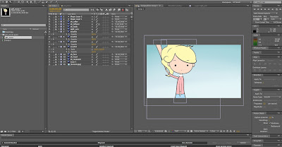
I have created the first scene of my animation in AfterEffects. This scene establishes the setting, panning down with an extreme long shot of the main character- the cat. His colour & movement contrast the stillness and colour of the setting, making him the focal point of this scene.
Sunday, 17 March 2013
Timing & Motion
Research
As timing and motion is very crucial at this animation stage, it is a good time to look back at the animation principles research I compiled earlier-Timing and Motion
The speed of an action, i.e., timing, gives meaning to movement, both physical and emotional meaning. The animator must spend the appropriate amount of time on the anticipation of an action, on the action, and on the reaction to the action. If too much time is spent, then the viewer may lose attention, if too little, then the viewer may not notice or understand the action.
Timing can also affect the perception of mass of an object. A heavier object takes a greater force and a longer time to accelerate and decelerate. For example, if a character picks up a heavy object, e.g., a bowlng ball, they should do it much slower than picking up a light object such as a basketball. Similarly, timing affects the perception of object size. A larger object moves more slowly than a smaller object and has greater inertia. These effects are done not by changing the poses, but by varying the spaces or time (number of frames) between poses. Motion also can give the illusion of weight.
In-between frames are what make up the time, so I looked at the difference animators suggest different numbers of in-betweens create in order to imply certain meanings/ emotions-
- No in-betweens - the character has been hit by a strong force and its head almost snappedd off
- One in-betweens - the character has been hit by something substantial, .e.g., frying pan
- Two in-betweens - the character has a nervous twitch
- Three in-betweens - the character is dodging a flying object
- Four in-betweens - the character is giving a crisp order
- Six in-betweens - the character sees something inviting
- Nine in-betweens - the character is thinking about something
- Ten in-betweens - the character is stretching a sore muscle
Examples of cartoons I have found that create a similar movement to what I am aiming to achieve, are:
The PowerPuff Girls
I really like the subtlty of the girls actions. Particularly around 0.30s, when theyre depicted flying to the scene of the crime. The flying is implied through the change in the background, and the discrete movements of their hair and blossoms ribbon. A classic example of less (animation)= more, and these implications given make it effective in showing exactly what the girls are doing. The body movements when fighting (0.50s) are done in a similar way, and this is the way I wish to move the characters and setting in my animation.
This show is another typical example of how subtle movements of elements can imply a lot. The emotions depicted on the characters dont vary a lot compared to the traditional based comic-like cartoons, but we still know exactly what id happening and it still appears believable. The mood is built by the speed of the camera, and the number of in-betweens in each segment. In my work, I will take a similar approach focusing on these minut movements and rapid camera angles to evoke certain moods and realistic animation.
Friday, 15 March 2013
Experimentation
Here's my first experimentation animating my character!
To help gain an understanding of the movements required, I have created a number of templates for my characters action sequences in my animation that I will constantly reference. Here are a few examples-
Tuesday, 12 March 2013
Type
I have decided that integrating full sentences into my animation would appear too busy, and thought about maybe picking out a few of the key words of the rhyme to help convey the message instead. That way the focus of the text wont draw the viewer away from the visual display of the cat and his scenario.
Because of my very strong anime-like style, I think it would add a stronger impact if I had the sentences written/ symbolized in Kanji. To experiment, I asked my Japanese friend to write down some characters for me of the key words I picked from the rhyme-
Then researched to find them on the computer-
|
Sneeze
|
嚔
|
|
Ring
|
環
|
|
Posy
|
花束
|
|
End
|
終
|
|
Fall
|
落
|
Sounds
I did some research into sounds, and found some good ones I can include as well as a background track to play.
Background Track-
Cat_Meow
Rain
Glass_Breaking
Plants_Dieing
Crows
Background Track-
Sound Effects-
Cat_Meow
Rain
Glass_Breaking
Plants_Dieing
Crows
Sunday, 10 March 2013
Animatic
Heres a clip of the initial animatic i have created to gain a better understanding of the timing and narrative of the animation-
Type Integration
Here are some fonts I looked at that would help blend the text within my animation subtly-
"Ring o ring o rosies"
these words are formed in scene 2, during a close up of the cat walking forwards. The text will be displayed on the concrete as the cat walks along, so I decided to look at fonts that gave the aesthetic of a concrete texture/ mould-
"a pocket full of posies"
for this sentence the text will form during scene 3, with a medium shot of the cat walking past a wall with plants growing along the path. These plants will form into the letters, and so I looked at fonts with a nature aspect to them-
"a-tishoo a-tishoo"
this line I have forming within the sky during the 5th scene, whilst the cat has unfortunate events happening around him-
"we all fall down"
lastly as the last sequence this forms during the end scene, when the white cat is left standing in the rain. I wanted this text to be displayed infront of the cat formed by the washed away dirt/ rain-
All fonts were located resourced www.dafont.com
Saturday, 9 March 2013
Setting
Here are some digitally painted scenes I've mocked up in correspondence to my storyboard. I decided to integrate the traditional method of animation by painting my backgrounds, then separately animating the characters and moving objects over top. I believe these reflect typical streets maybe on the outskirts of a city. When animating I will pan around and zoom in on particular aspects of the scenes depending on where I want the focus to be.
Scenes 1,2,9,11,12
Scenes 4,5,10
Scene 6
Scene 3
Scene 8
Scene 7
Thursday, 7 March 2013
Wednesday, 6 March 2013
Character Style
I was inspired when playing the 'Professor Layton' game series, and admired the style of their characters- particularly people. I think I could use a similar style when creating my minor characters. What I really like about them is there minimalism and simplifying of complex body features for example, the dotted eyes, slender figures, etc.
Storyboard
Story Idea
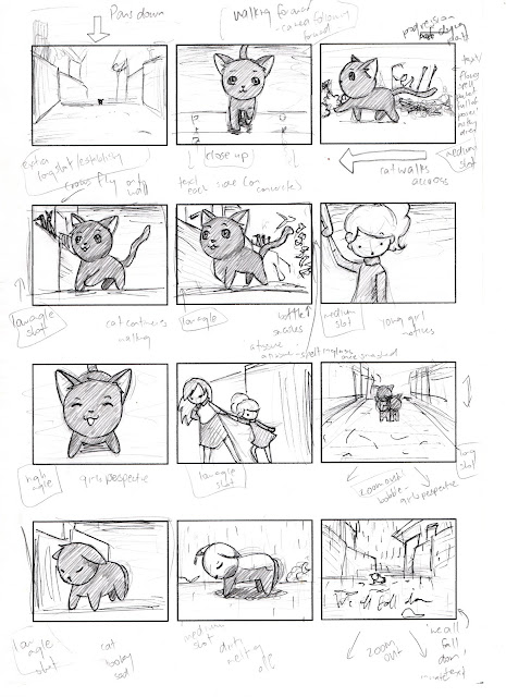
I decided to explore the theme of modern superstition within the nursery rhyme Ring-O-Rosies. My animation is based around a black cat walking down a city street, when bad things start to happen in his presence. People are deterred so the cat feels isolated. The animation finishes with the cat feeling unloved and sad. Rain then begins to fall and it turns out the cat is actually white in colour. This relates to the nursery rhyme through the belief of ridiculous superstitions "Ring-o-Rosies a pocket full of posies, explains a flower that was thought to keep away disease. "Atishoo! Atishoo WE all fall down" due to a large outbreak people became superstitious of any sign of any illness. A black cat is a modern superstition, thought to bring about bad luck.Storyboard
Type
I have been thinking about how to incorporate text/ type into my animation, and I was inspired when I saw the movie 'Catch Me if You Can' opening sequence. The visual style used narrates and spells out the names well and integrates nicely with the scene. I really enjoy the characters interaction with the elements of the text, and would like to include these techniques to help narrate animation.
Tuesday, 5 March 2013
Experimentation
I wondered when playing with my main character sheet what the image would look like without the outlines- and I actually quite liked it! It made it look less cartoon like and more unique. If I chose to continue with this style I would use Illustrator as it will give me much cleaner lines.
Setting
Style
I've decided to base my scene in a street close to the city. Because there is alot of activity, which suits the city scene well. Also its not as unusual to have a cat wandering around with people avoiding interaction.
The type of style I'm going to use to create the setting, is a more generic subtle gradient style with no major contrast or outstanding textures. Similar to that of anime 'Cardcaptors'-
Colour & Texture
I have created a more natural colour pallette. I will use the yellowish brown colours as my background on the canvas, then paint the others over top- bringing all colours into a harmonious family and striking the viewer as its not often expected in a city street setting. These colours will be used to paint the sky, plants, walls and surrounding houses-
Though I'm not including outstanding textures, I might incorporate a few textures subtly to help give the viewer a better feel of what it is they are perceiving particularly as the cat is very small, so there will be alot of close ups that will need to be established.
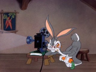
Cartoons I looked at that have a natural colour scheme are Looney Tunes' 'Bugs Bunny' and 'Daffy Duck'-
URL- http://johnkstuff.blogspot.co.nz/2006/10/color-theory-neutral-or-natural-colors.html
Subscribe to:
Comments (Atom)


